With the rise of smart energy meter data, it seemed sensible to start my PhD on Smart Grid analytics by analysing some of it. Analysing this data using machine learning techniques could help utility companies in better understanding their customers, and offer personalised packages based on their usage. The overall goal being to reduce peak usage which puts a strain on the network.
I found a cool dataset that had energy usage data across the USA. It contained data on different building types such as restaurants, homes, hotels and hospitals, and the energy used such as electricity, gas, heaters, lights and air-conditioning.
The first, and important step was importing 20GB of data.
I did this using a combination of cbind and lapply to iteratively read through all the different .csv files.
filenames = list.files(recursive = T)
base_data = do.call(rbind,
 lapply(filenames, function(x)
    cbind(file=x,csv_error(x)[,c("Date.Time","Electricity.Facility..kW..Hourly.")])
 ))
I only wanted to analyse the general electricity data, and so filtered out the rest of the columns for later use. However, I came across a problem. A small number (5) of the CSV files measured the electricity in Joules, as opposed to kilo-watts. I fixed this problem through the use of exception handling that R has on offer (try function).
csv_error = function(x){
 err = try(read.csv(x)[,c("Date.Time","Electricity.Facility..kW..Hourly.")])
 if ("try-error"%in%is(err)) {
 print(x)
 return(read.csv("COMMERCIAL_LOAD_DATA_E_PLUS_OUTPUT.part1/USA_CA_Camp.Pendleton.MCAS.722926_TMY3/RefBldgPrimarySchoolNew2004_7.1_5.0_3B_USA_CA_LOS_ANGELES.csv"))
 }else{
 return(read.csv(x))
 }
}
This small function prints the suspecting csv’s and continues to add the rest of the csv’s to a dataframe.
After converting the date information to an R friendly format (POSIXct), I was able to extract useful date and time information.
The first thing I wanted to do was explore the data. I needed to know whether I could spot any interesting patterns which would enable me to explain the data and help in classification.
I plotted some quick plots of all the buildings based upon their usage.
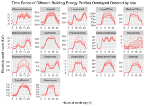
The plot shows that different buildings with the same use have very similar energy profiles. It must, therefore, be possible to classify these buildings based on their profile usage.
To better understand the data it is possible to delve deeper into the patterns.
- Residential Properties, Hotels, and Apartments all have similar energy usage. Two peaks during the morning at 8 am, and at 8 pm. These peaks clearly refer to the morning and evening peaks, before and after work respectively.
- Hospitals, outpatients, malls, supermarkets, secondary schools, and offices all have a similar energy profile, with a typical 9 til 5 usage profile. With a slow ramp up and ramp down starting at 5am, and ending at around 8pm.
- Restaurants have a distinct profile, with 3 peaks during the hours of 8 am, 12 pm, and 7 pm. These, I imagine, relate to breakfast, lunch and dinner.
Machine Learning and Statistical Analysis
Once the data was cleaned and explored, it was time for some machine learning.
In this case, we required an unsupervised clustering technique, as we did not necessarily know the distinct similar groups. For this, there are two main methods, k-means clustering and hierarchical clustering.
K-Means clustering is a technique which moves k number of cluster centres towards clusters of data points. Hierarchical clustering starts with either a single point, or all the points, depending on the technique used, and clusters together similar groups. I have only documented K-Means clustering in this post.
K-Means Clustering
There are many ways of summarising the data to be used as input into the K-Means clustering algorithm. Extracting features from the data, inputting the raw data, or a model based approach.
Here we tested feature extraction, and raw data to see which would work best.
Feature Extraction for K-Means Clustering
I extracted a number of different features, such as maximum electricity used, minimum electricity used, average electricity consumption, the total number of peaks, highest peak time and height, second highest peak time and height, the sum of electricity used and standard deviation.
This was then inputted into the k means clustering.
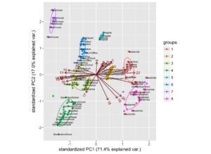
We can examine how each feature affects the k-means clustering using a PCA plot, which enables us to plot all of the previously mentioned dimensions on a single 2-dimensional plot.
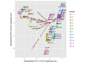
Each of the clusters (groups) can be seen to correctly classify many groups such as outpatient, restaurants, hotels and more.
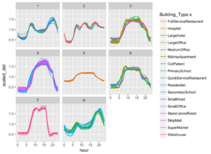
I then plotted each of these clusters in the time domain below
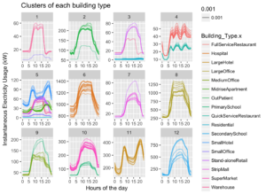
Here it can be seen that similar buildings have been clustered together. With a high success rate for all clusters apart from cluster 5.
Raw Data K-Means input
A different approach was taken for the K-Means algorithm, with the input data being solely the scaled data. The data was scaled by dividing each point by the mean.
The PCA plot is shown below.
The output of this clustering is shown in the time domain below
This method was very successful in clustering similar patterns, and less successful in clustering similar business types.
However, for this analysis this is precisely what is wanted.
This machine learning technique has therefore given us a way to automatically cluster a user based on the energy they use throughout a day. We can then use this information to give them various offers to change their usage to aid in reducing peak energy usage.
This has been a summary of the total work done. To see all of the source code, plots and report, take a look at my github repository at the following link
https://github.com/alexanderkell/Building-Energy-Analysis